Product brands optimize for one audience buying one thing, repeatedly, over months and years. An event brand has to hold together for an exhibitor setting up a booth at dawn, a competitor warming up backstage, and a first-time attendee trying to find the roaster village — all inside the same convention center, often within the same afternoon. That’s a fundamentally different design problem, and it changes what “good” means. We learned this firsthand when documenting the visual identity work for World of Coffee Jakarta and the World Coffee Championship — two of the most prestigious events in the global coffee industry. Both projects were produced by Hogarth Jakarta for the Specialty Coffee Association (SCA), with case studies produced by WOBL Creative.
Adaptability beats consistency at the live-event layer
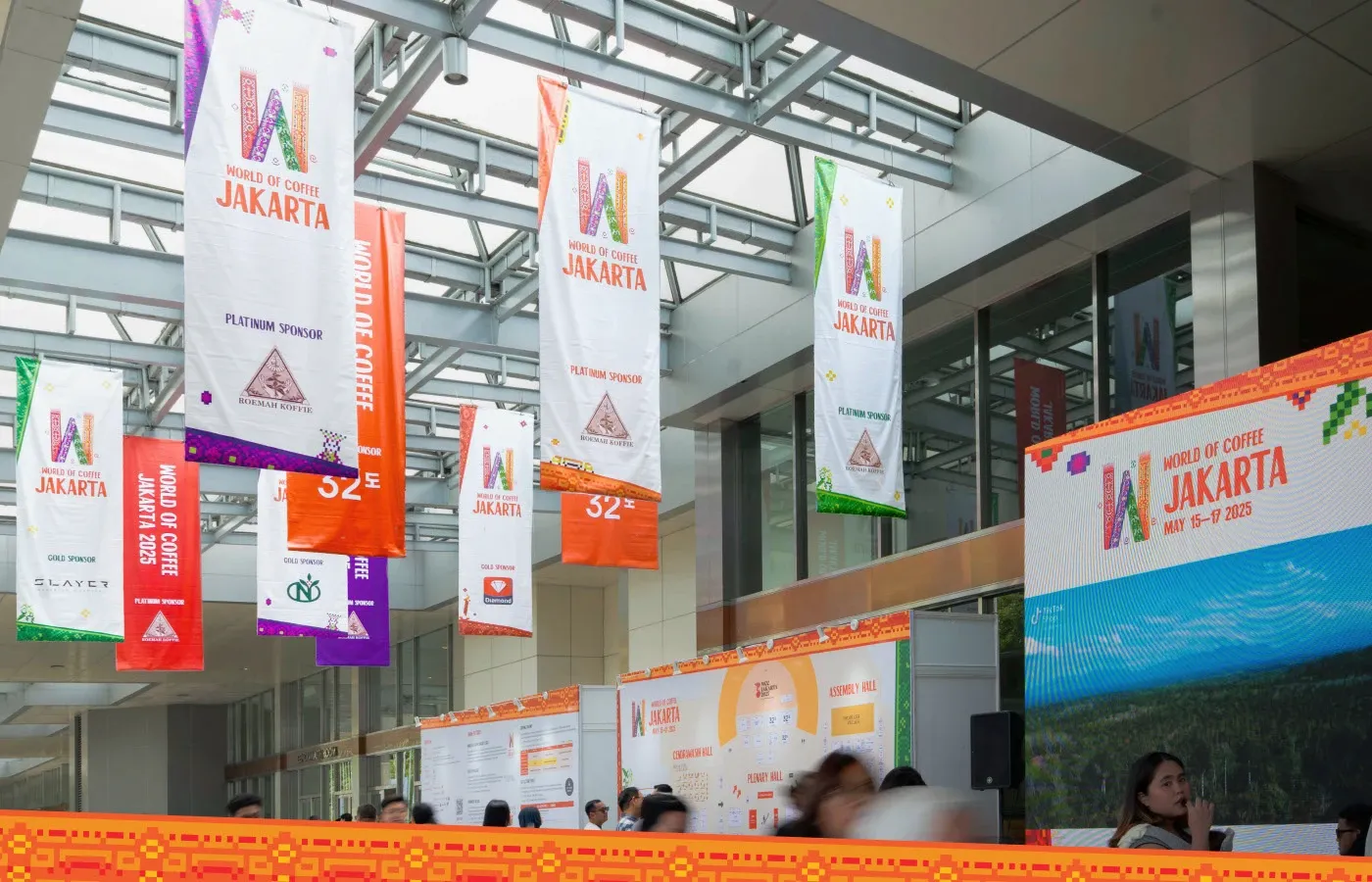
A bold, expressive logo can carry a homepage or a social media tile with ease. It usually fails on a convention floor banner someone reads for two seconds while juggling a coffee sample and a schedule booklet. The World of Coffee Jakarta identity, designed under the Hogarth Jakarta team, used a flexible design system — not a single rigid logo application — because adaptability mattered more than pixel-perfect consistency at that specific touchpoint. The full expressive mark stays for the entrance archway, the website hero, and merchandise where there’s time to pause and appreciate it. On directional signage and lanyard credentials, a stripped-down version takes over, prioritizing clarity over personality. The brand doesn’t abandon its character; it simply knows when to speak loudly and when to speak clearly.

Source: https://www.behance.net/gallery/230808273/World-of-Coffee-Jakarta/modules/1323345649
One identity, several contexts — host city, global championship, and everything in between
An event needs a local register that honors the host city’s culture, a global register that maintains the championship’s prestige, and a cohesive register that makes everything feel like it belongs under the same roof. When the Hogarth Jakarta team designed the identity for World of Coffee Jakarta — the first World of Coffee ever held in a coffee-producing country, right in Indonesia — they drew from Indonesian linen patterns and Jakarta’s iconic landmarks, weaving local heritage into a global event brand. The result is a brand experience that sparks joy and excitement while still feeling unmistakably like World of Coffee. Rather than two separate identities — one “local” and one “international” — they built one typography and color system flexible enough to shift context through layout and pattern, not through inconsistent logos. Jakarta’s diversity — cultures, colors, and religions coexisting harmoniously — became the design’s DNA, not an afterthought.
Source: https://www.behance.net/gallery/230808273/World-of-Coffee-Jakarta/modules/1324428999
Meanwhile, the WCC (World Coffee Championship) identity faced a different challenge: one cohesive brand expression across three host cities — Houston, Jakarta, and Geneva — for the first time in the championship’s history. The identity weaves together three international host cities into a single visual expression, reinforcing collaboration, inclusivity, and the shared values that define its global community. Every element of the experience — from visual design and communications to the way the event is recognized worldwide — speaks the same visual language regardless of which city you’re standing in. One identity, three cities, one unmistakable championship.
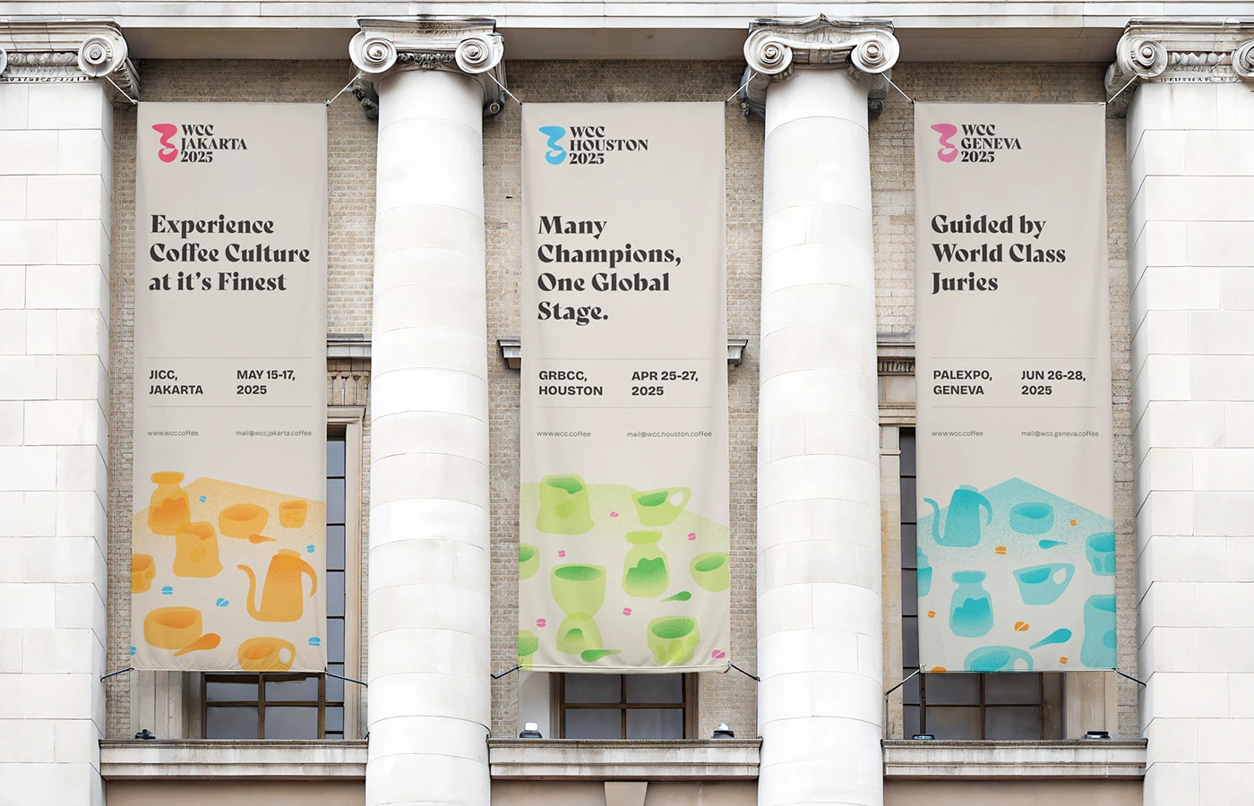
Source: behance.net/gallery/235663805/WCC-HOUSTON-JAKARTA-GENEVA-BRAND-IDENTITY
Ephemerality is the actual brief
Product brands can refresh every few years and still maintain continuity — their audience sees them repeatedly, building recognition over time. Events exist for three to five days, then vanish. The identity needs to make an overwhelming impact in that short window — every surface, every touchpoint, every moment — because there’s no “next visit” to reinforce the message. Attendees won’t see the brand again until next year, maybe in a different city, with a different host culture. That changes the design approach entirely: the identity must be immediately legible and emotionally resonant, not subtle or layered. World of Coffee Jakarta’s vibrant, pattern-rich identity doesn’t whisper — it shouts. It has to. Three days is all you get.
But here’s the twist: while the event itself is ephemeral, the identity system needs longevity. World of Coffee rotates to different cities annually, and the WCC now spans three cities per cycle. The visual framework needs to hold up structurally across years and geographies — like a typeface with a full weight range and a pattern system that can adapt to local culture without breaking the global brand — rather than relying on a single trendy display motif that ages fast or only works in one cultural context. The best event identities are built like tents: the structure lasts, the decorations change with every festival.
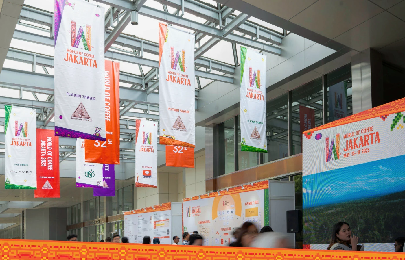
Source: https://www.behance.net/gallery/230808273/World-of-Coffee-Jakarta/modules/1323297577
How is event visual identity different from a corporate identity project?
The core difference is velocity and volume. An event identity has to survive at once: stage backdrops, lanyards, social media tiles, directional signage, merchandise, press releases, and mobile push notifications — often produced by different vendors on different timelines, all converging on the same venue within the same week. A corporate brand usually controls far fewer physical formats and has months to refine each one. An event brand gets days. The stakes are higher because the timeline is shorter, and the audience is wider because the event draws people who’ve never seen the brand before and won’t see it again until the next edition, if they even attend that one.
An event brand isn’t judged by how striking it looks on a Behance portfolio. It’s judged by whether a stranger can find the roaster village, feel the energy of the championship, and remember the event’s name a year later.
Project Note
The World of Coffee Jakarta and WCC (World Coffee Championship) visual identity projects were produced by Hogarth Jakarta for the Specialty Coffee Association (SCA). WOBL Creative produced the case studies documenting this work on Behance. The art director, Bimo Finca Azvy, previously worked at Hogarth Jakarta on these projects and now continues his creative practice at WOBL Creative, where he documented the case studies for the projects he originally art-directed. The project work remains the property of Hogarth Jakarta.
Sources
World of Coffee Jakarta Case Study — https://www.behance.net/gallery/230808273/World-of-Coffee-Jakarta
WCC Houston Jakarta Geneva Brand Identity Case Study — https://www.behance.net/gallery/235663805/WCC-HOUSTON-JAKARTA-GENEVA-BRAND-IDENTITY
World of Coffee Asia Press Center — https://asia.worldofcoffee.org/press-center/9