The word “rebrand” scares founders because it sounds like throwing away everything people already recognize. The logo they sketched on a napkin at 2 AM. The color their first customer mentioned in a review. The name that took three months of debate and one passionate email from the CEO’s spouse. It feels like admitting failure—like saying, “What we built wasn’t good enough.” But that’s almost never the truth. In practice, most rebrands keep more than they change. The question isn’t “what’s new?” It’s “what’s actually broken?”
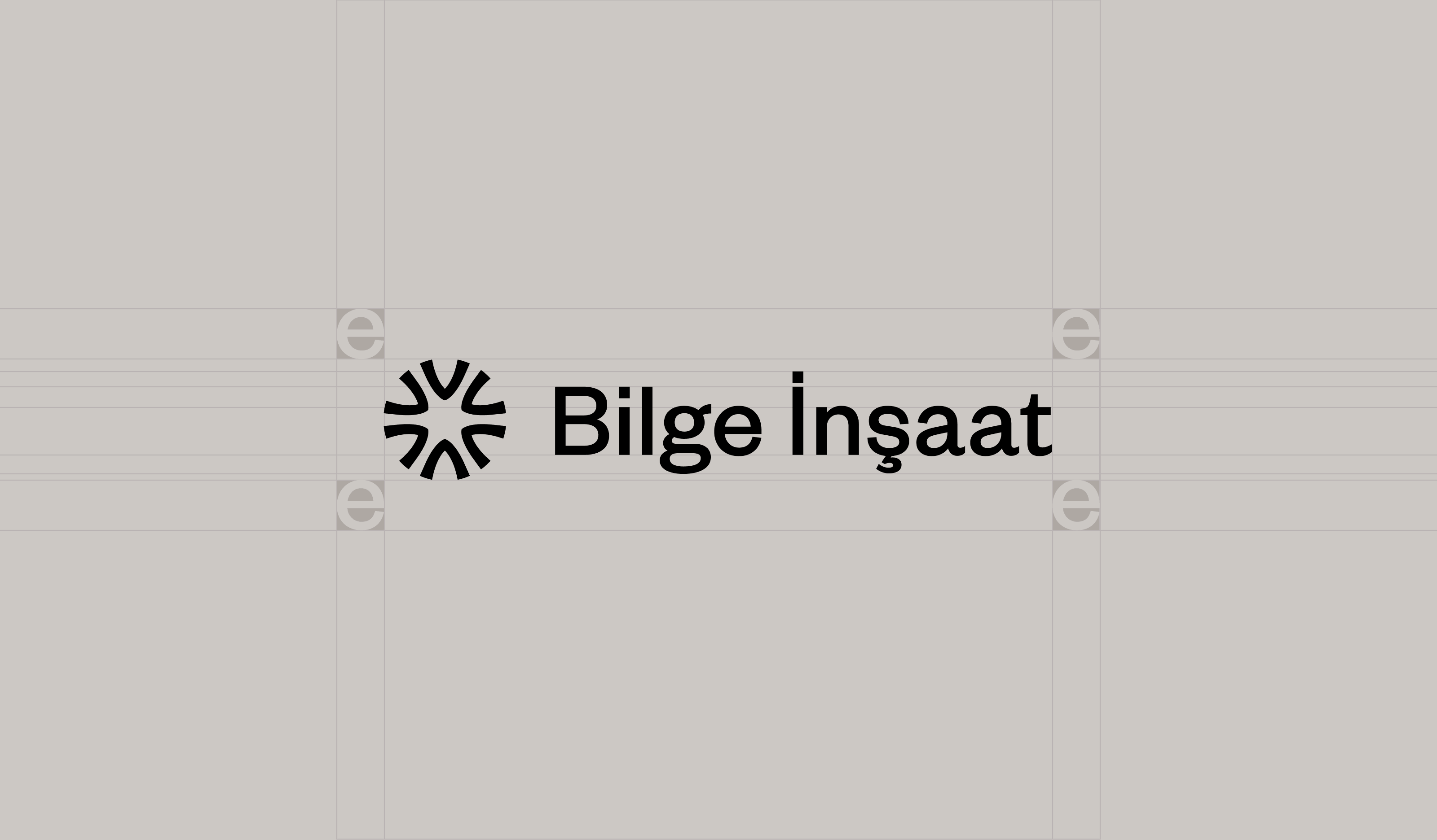
We learned this firsthand when Bilge İnşaat—a real estate developer specializing in urban renewal along Istanbul’s prestigious Bağdat Avenue—came to us. They didn’t need a new identity. They needed their real identity, finally visible. And the process taught us something we now apply to every rebrand: you don’t tear down the building. You read its structure, understand its bones, and renovate so the world can finally see what was always there.
Start by Diagnosing, Not Designing
Before opening any design file, ask the uncomfortable question: what specifically isn’t working? Is the logo fine but the color palette dated? Is the name strong but the visual system so inconsistent that the Instagram grid, the website, and the pitch deck look like three different companies sharing a phone number? Skipping this step is how brands end up with a brand-new logo that solves nothing, because the actual problem was an Instagram grid that looked nothing like the website.
When Bilge İnşaat reached out, their creative director Febri Adiawarja didn’t start with mood boards. He started with diagnosis. The company had evolved far beyond what its visual identity communicated. They weren’t just builders—they were master artisans transforming old structures into characterful, life-enhancing homes. But the world couldn’t see that. The brand said construction. The reality said something far more interesting. That’s the gap a rebrand closes—not by inventing something new, but by revealing something true.
Keep the Equity, Fix the Friction
Brand recognition takes years to build and disappears fast if you discard it carelessly. When a rebrand keeps a recognizable color, a distinctive icon, or even just the weight of a familiar name—it gives existing customers a bridge instead of a jump scare. The goal is usually evolution: a loyal customer notices it as “better,” not a stranger’s brand they don’t recognize.
Bilge İnşaat’s name was never the problem—it was the solution waiting to be understood. “Bilge” means wise in Turkish. Not textbook wisdom, but the kind that lives in hands that have shaped concrete and steel through Istanbul’s seismic reality. And what they did with that wisdom—transforming aging buildings into extraordinary spaces—was alchemy. The Wise Alchemy wasn’t a tagline we invented. It was a truth we uncovered. The name stayed. The location stayed. The clientele stayed. What changed was the articulation.
This principle applies beyond real estate. A fintech startup that outgrew its playful mascot doesn’t need to abandon the color its early adopters associate with reliability. A fashion label whose serif logo feels dated doesn’t need to switch to a cold sans-serif that erases its heritage. The surgical move is keeping what carries trust and fixing what creates friction.
Systems, Not Just Assets
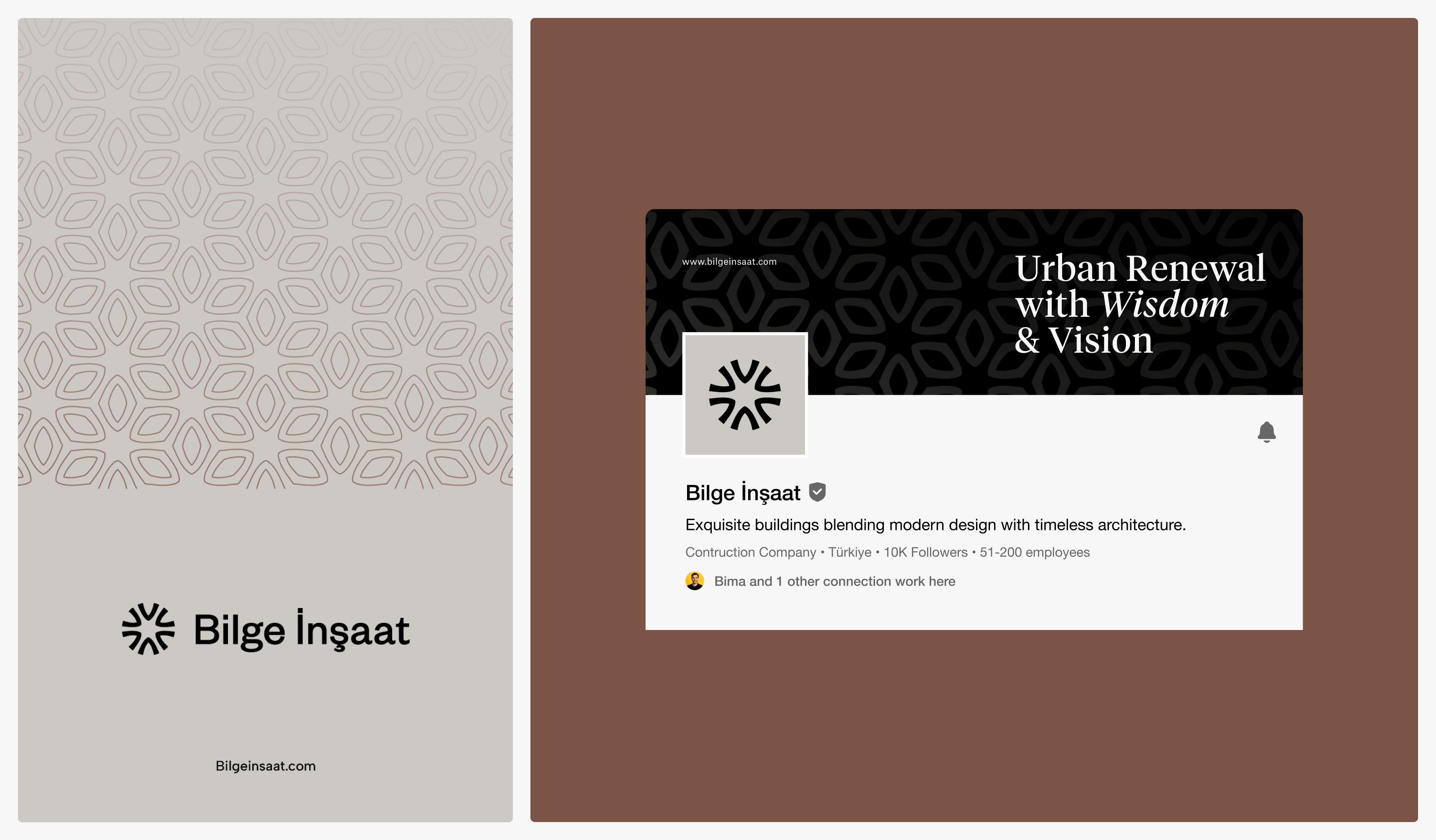
A logo redesign without a system behind it just moves the inconsistency problem somewhere else. The Instagram grid still fights the website. The pitch deck still contradicts the signage. The business card still feels like it belongs to a different company than the letterhead. A real rebrand ships a typography scale, a color system with defined use cases, photography and illustration direction, and templates for the formats the brand actually uses—social posts, pitch decks, construction hoardings, email signatures—not just a logo file and a Pantone chip.
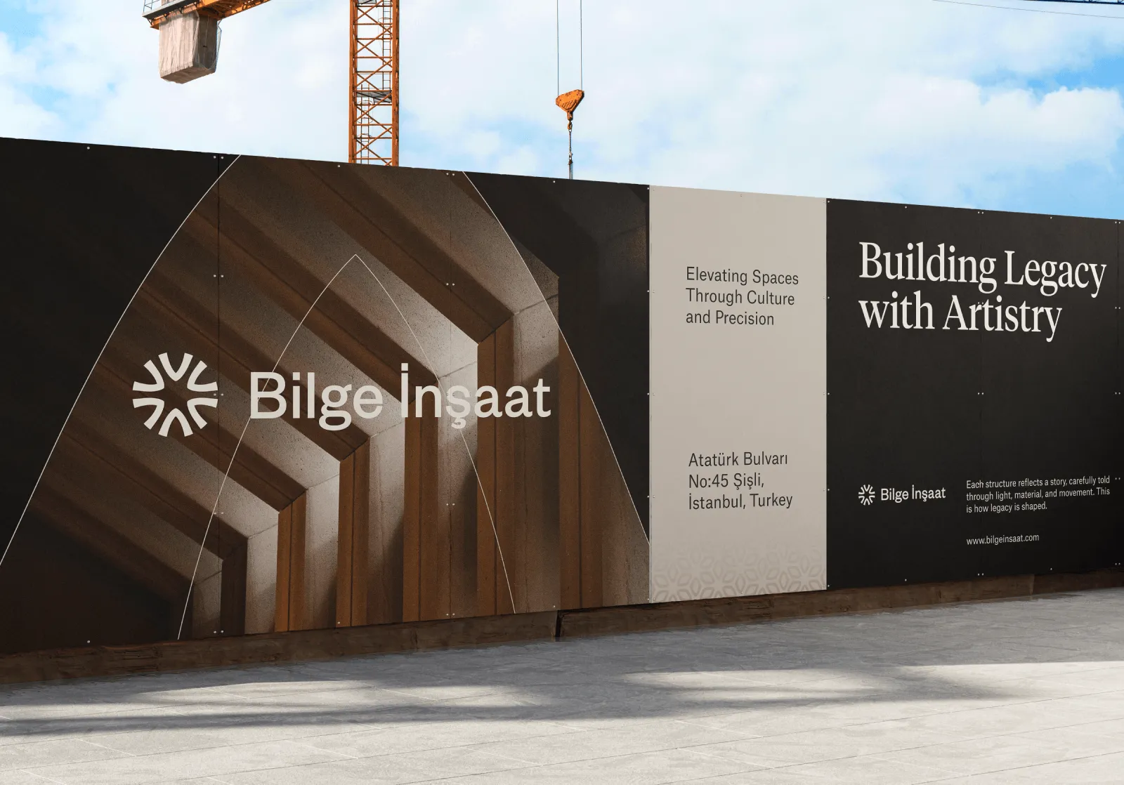
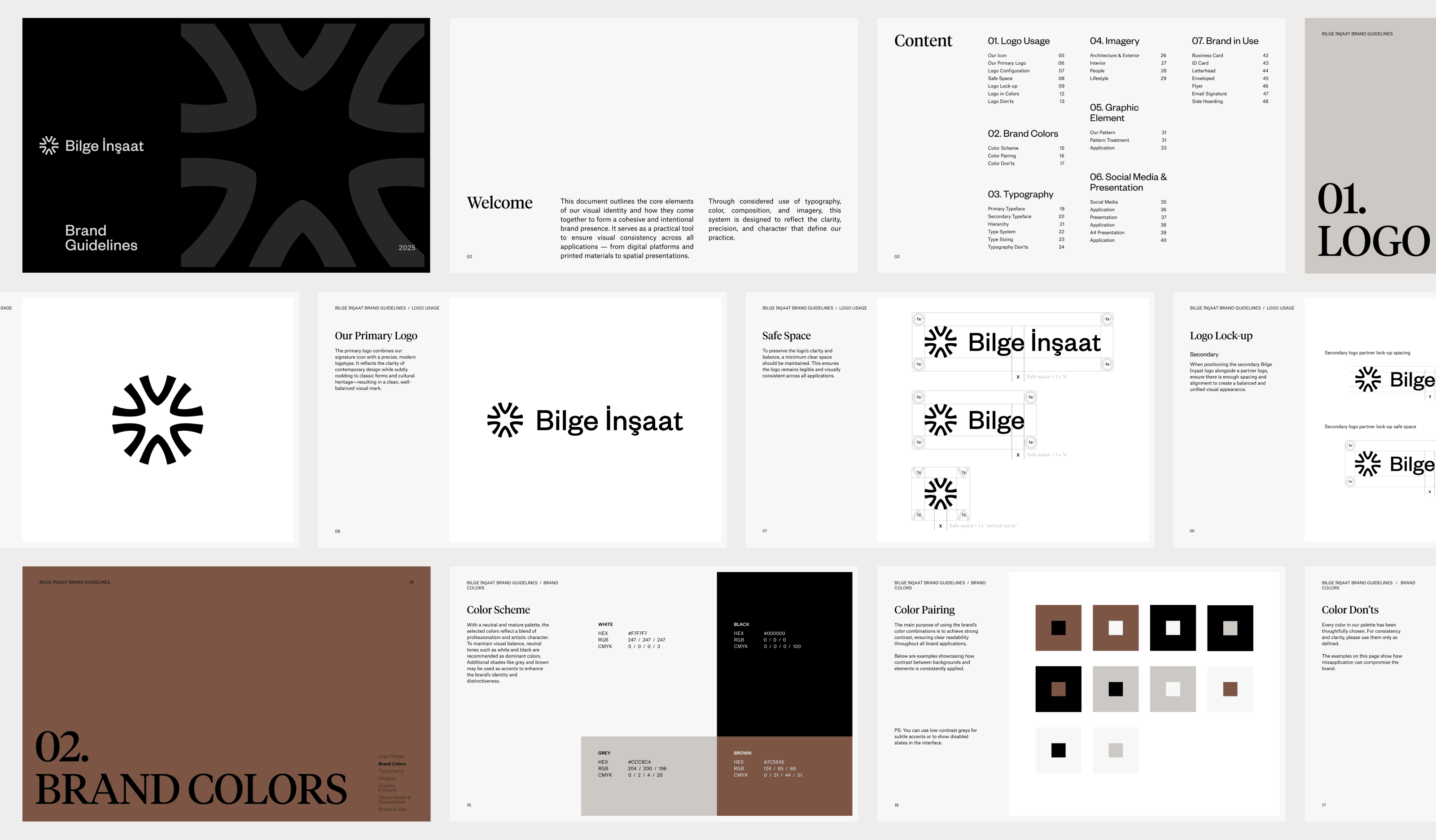
For Bilge İnşaat, this meant delivering a complete ecosystem: brand guidelines with a graphic standard manual, business cards, letterheads, ID cards, construction site hoardings, email signatures, supergraphic patterns with usage rules, a 26-slide presentation template across three platforms, and a social media kit covering every format. Every surface where the brand appears now speaks the same visual language—wise, refined, unmistakably its own.
The lesson is universal. If your rebrand only produces a logo, you haven’t rebranded. You’ve redecorated one room and left the rest of the house inconsistent. The system is the brand. The logo is just the front door.
The People Who Make It Real
A rebrand is not born in isolation. It emerges from the collision of minds, the friction of perspectives, and the trust that lets creative people disagree fiercely and still build something together. In the Bilge İnşaat project, art directors Bimo Finca and Lutfi Abdul Aziz debated whether the visual approach should lean toward stark minimalism or gracious warmth. Graphic designers Lutfi and Kemal Hasanudin pushed the exploration toward a third path—one that carried cultural resonance without nostalgia, serif letterforms that felt timeless and contemporary at once. Web designer Vicky Alldan Muhammad extended the language into digital space. And client Kağan Kurt brought the vision and the trust that held it all together.
None of them worked alone. The creative direction was a conversation. The art direction was a debate. The graphic design was a translation. The web design was an extension. And the client’s trust was the foundation. The best rebrands are not solo performances. They’re ensembles.
A rebrand that works doesn’t erase a company’s history. It just stops making customers work to recognize it.
So before you sign off on that mood board, ask yourself: am I renovating or demolishing? Am I keeping the bones and fixing the facade, or am I tearing down something that still holds weight? Most brands don’t need a new identity. They need their real one, finally visible. The wise alchemist doesn’t burn the old to build the new. They read the old, understand its structure, and transform it into something the world finally notices.
See the complete brand system: https://www.behance.net/gallery/231472123/Bilge-nsaat-Modern-Real-Estate-Branding
Visit Bilge İnşaat: bilgeinsaat.com